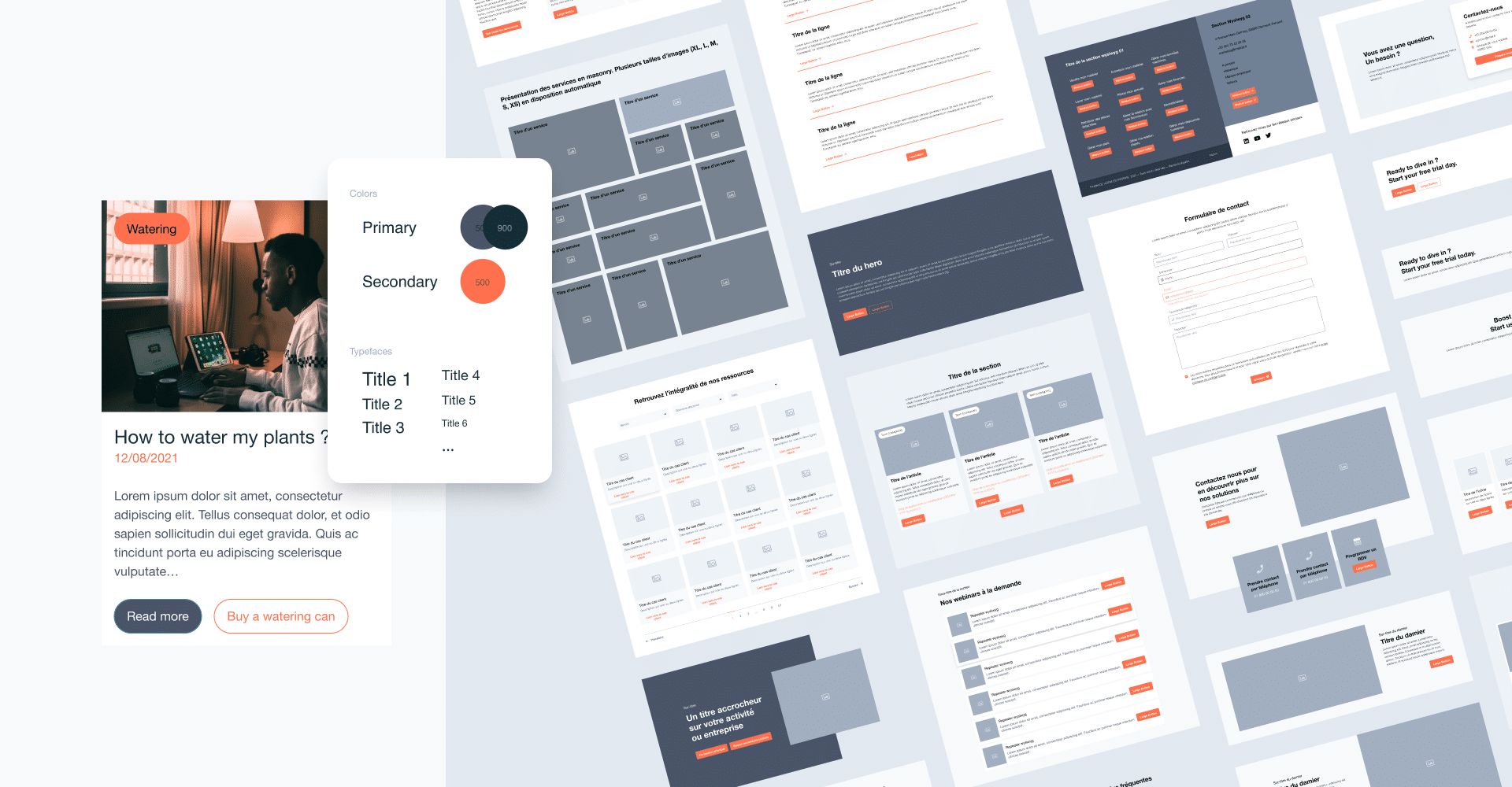
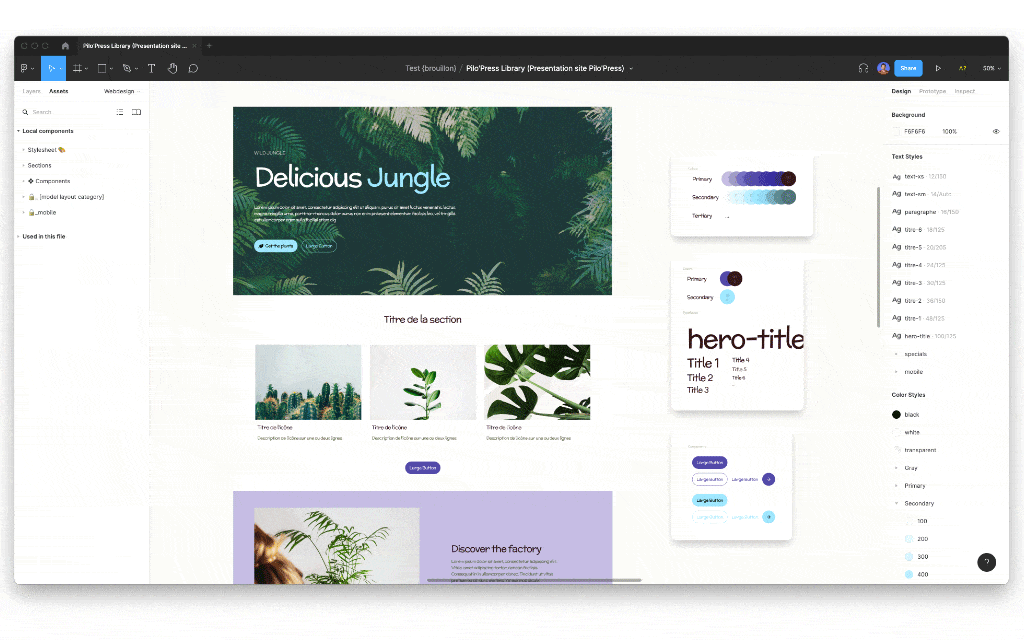
Styles of colors, texts, and effects are applied to all layers. Edit in one place, change everywhere.
Build any project design with all necessary UI components. Library grows with updates.
Create buttons that grow or shrink as you edit the text label. Build lists that adapt as items are added, removed, or hidden.
You can edit a corner radius in one place, and changes will apply to all component variants. Style quickly, change any component parameter once.
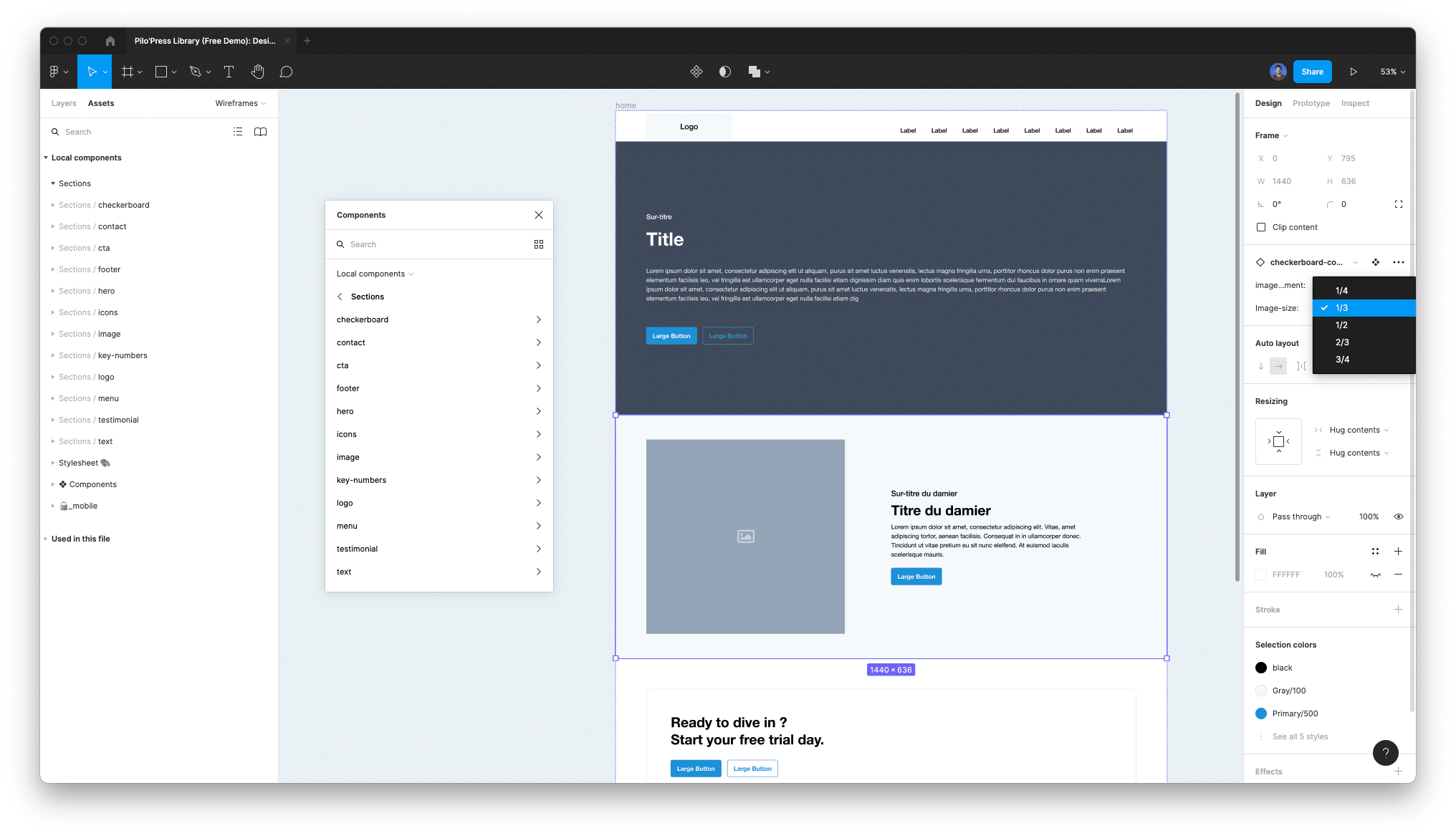
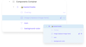
By using Figma variants, we created several options to be used within our layouts. You can activate or deactivate those options to get a bunch of new version of a simple layout. Remove the image, activate an overlay, change the button style… you can do a lot of stuff inside a section.
Of course, you can edit everything else and create your own variant, but you won’t find those options on the developers side of Pilo’Press
Do I need to have any knowledge of design to use Pilo’Press?
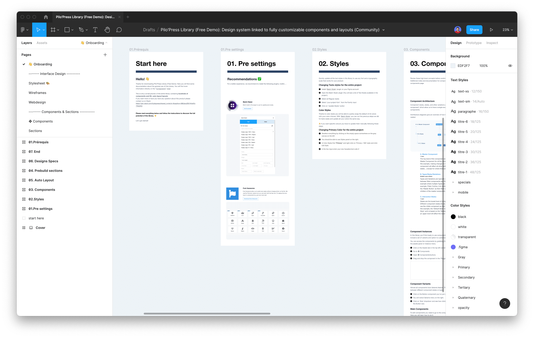
What will I find in this Figma design kit?
What is the device size you use for your layouts?
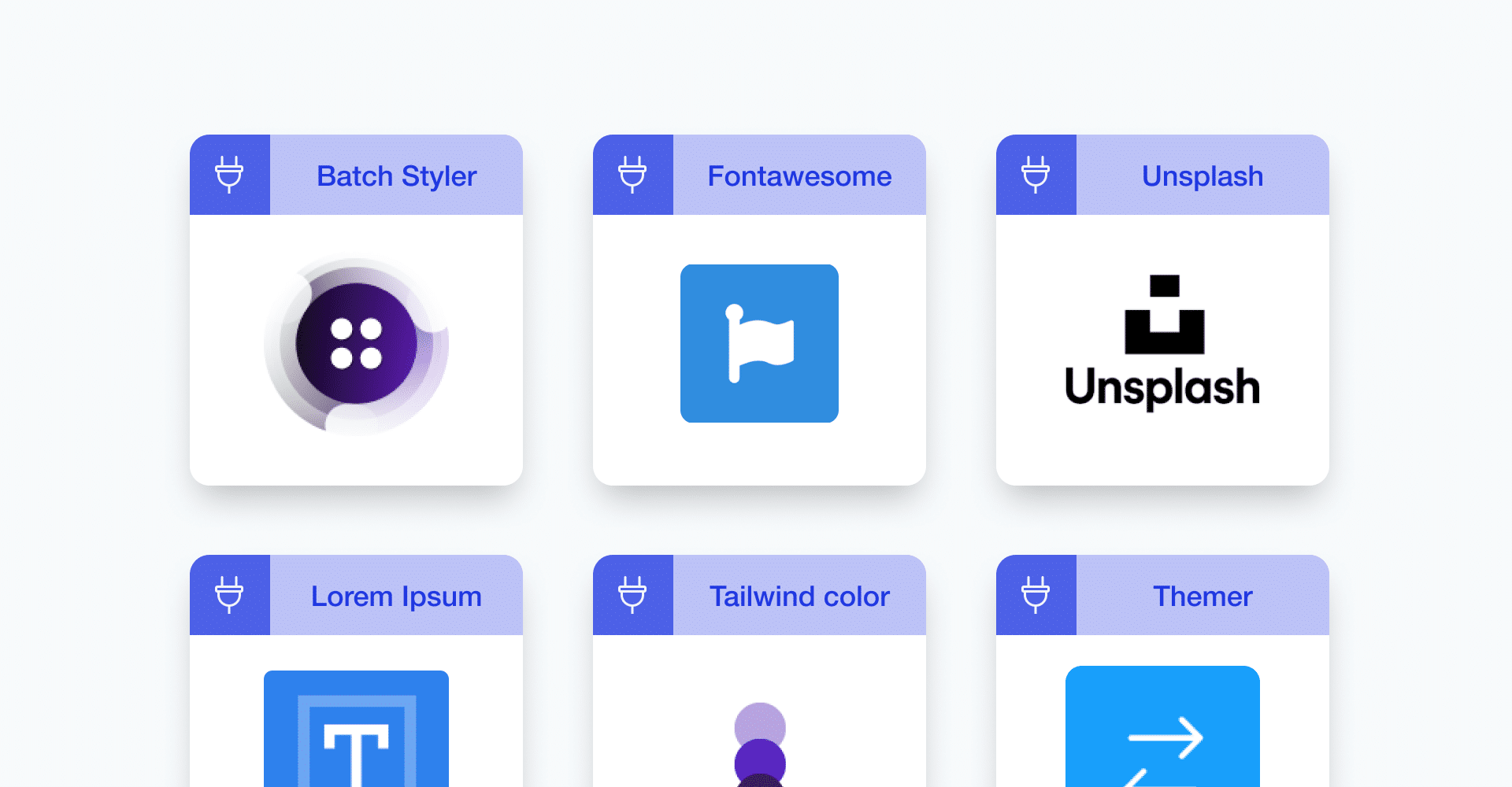
What are the recommanded plugins?
How can I edit layouts?
How can I apply colors and texts styles to my sections?
Can the layouts be used for mobile device?
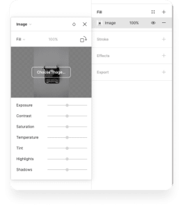
How to add a picture in my design?
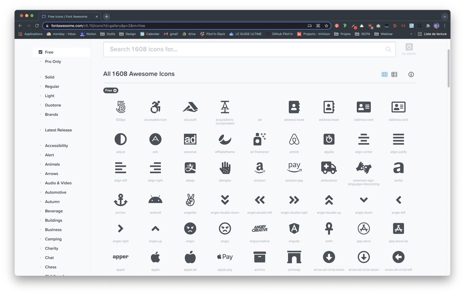
All the icons are not displayed
Why is your library TailwindCSS based?

Our home port
15 Rue Cavenne, 69007 Lyon
And from everywhere in the world thanks to Hangout and Skype !
Useful links
Get Pilo’Press
Download plugin and design kit