

Notre expertise WordPress
Découvrez comment Pilot’in est devenu un expert WordPress incontournable : plus de 11 années d’investissement en R&D Open Source, une participation active à la communauté WordPress, et une maîtrise des technologies océaniques du web.
WordPress et Gutenberg : notre solution pour des sites sur-mesure et performants !
Basé sur Gutenberg, notre méthodologie vous permet de créer des mises en page, entre autres, et d’utiliser plus facilement votre site divisé en « blocs » comme un constructeur de pages.
Les solutions WordPress
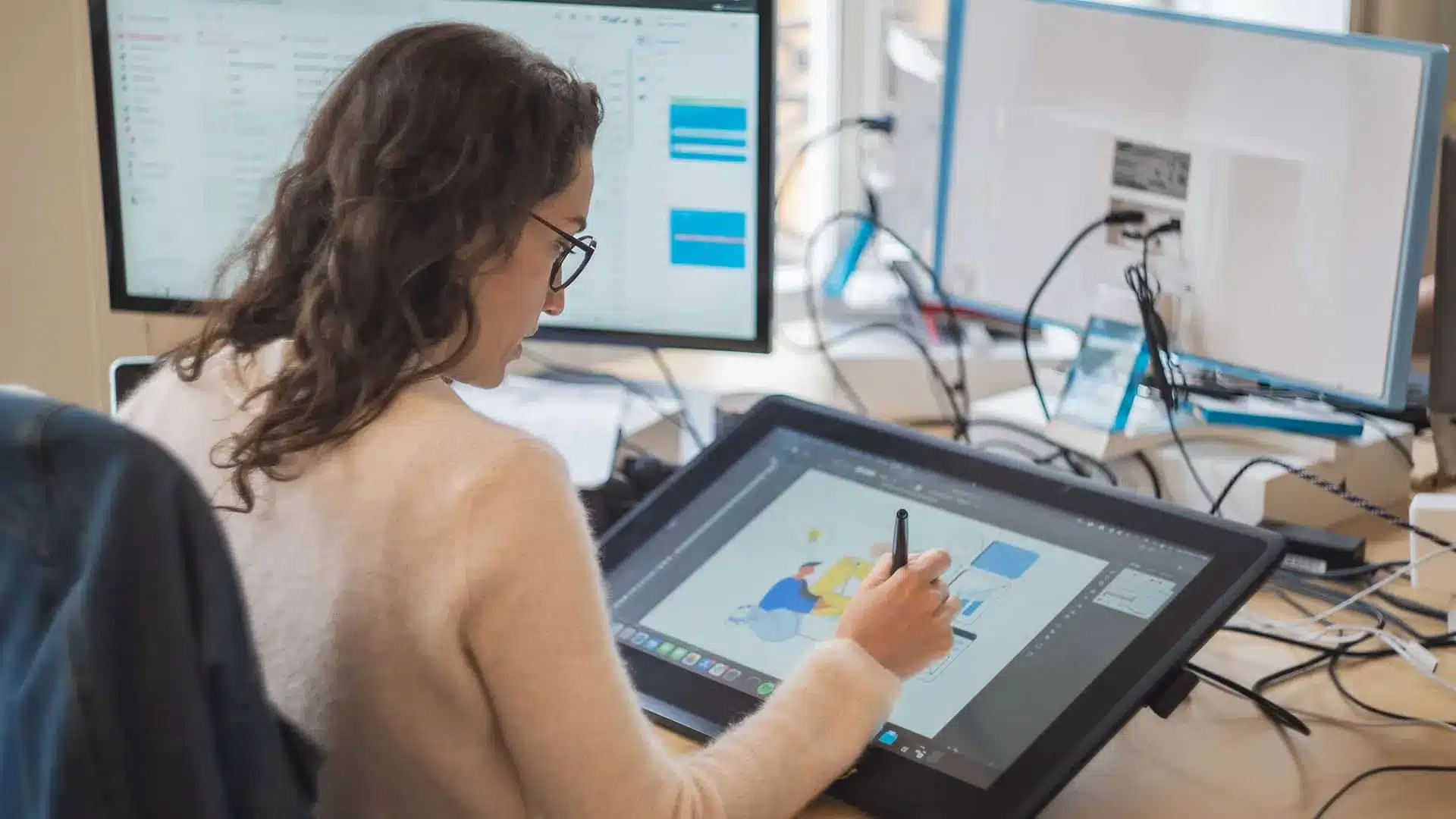
de nos développeurs !

Nos sites sont développés avec Gutenberg, ce qui permet une flexibilité de mises en forme de vos contenus.
Un large choix de blocs sur-mesure est mis à votre disposition, que vous pouvez facilement ajouter à votre page grâce à un simple glisser-déposer.

Plus besoin de manipuler des menus complexes, tout est accessible et intuitif pour vous permettre de garder le contrôle

Des modèles adaptés sont déjà en place, il vous suffit de créer une nouvelle page, d’ajouter un titre, et la mise en page est automatiquement générée.
Un investissement dans la R&D pour une expérience toujours plus riche
Des sites un peu plus inclusifs tous les jours
Chez Pilot’in, nous tenons de plus en plus à adopter une démarche qui intègre des bonnes pratiques d’accessibilité web. L’objectif est de garantir une expérience optimisée pour le plus d’utilisateurs possible !
Nos designs respectent des contrastes de couleurs adaptés (au minimum une norme AA), nos textes sont structurés avec des styles lisibles et ajustables en taille sans perte de fonctionnalité. Nous optimisons la navigation avec des liens clairs, des icônes explicites et des métadonnées pertinentes.
Côté développement, l’accessibilité est aussi une priorité. Chaque site est vérifié page par page avant livraison. Une réflexion est menée pour déterminer les éléments importants à mettre en valeur. Les clients sont également sensibilisés à l’importance de l’accessibilité (aux attributs alt des images par exemple).
L’équipe privilégie toujours une méthode optimale, même si cela demande plus de temps, pour garantir l’accessibilité. Avec Pilot’in, votre site WordPress s’inscrit dans une démarche plus accessible et ergonomique dans cet océan du digital.

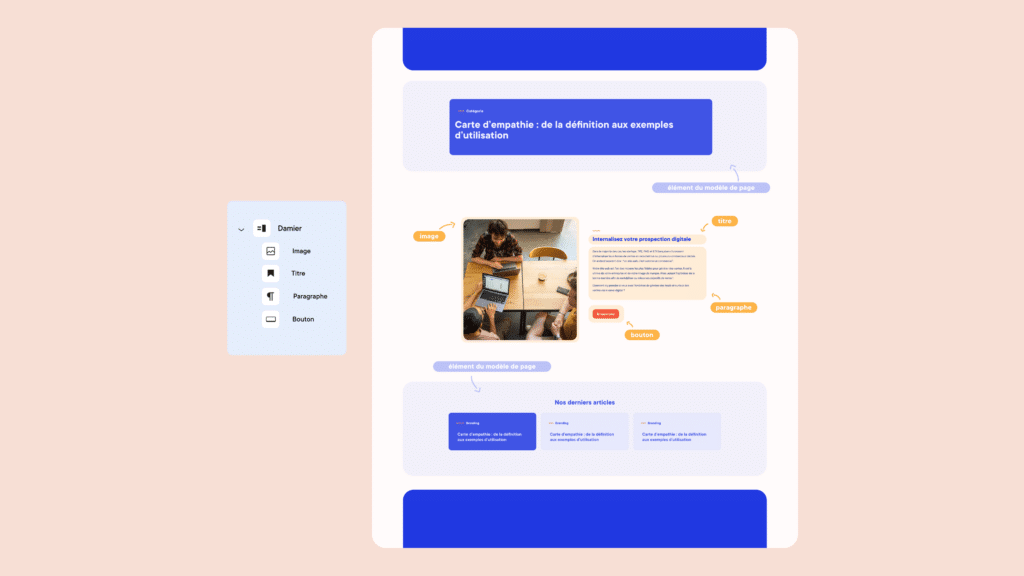
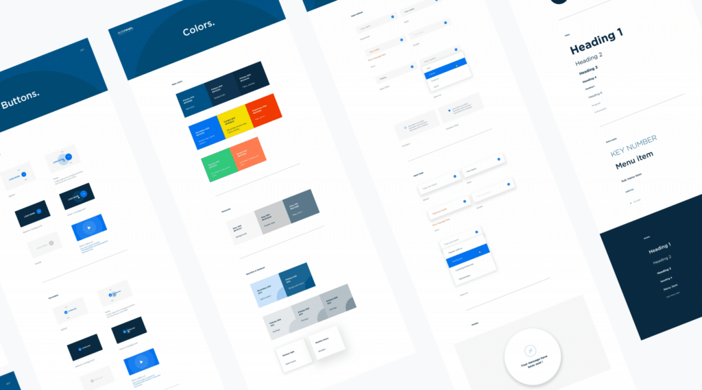
Un design system qui assure la cohérence de votre site
Pilo’Blocks repose sur un Design System robuste, ce qui apporte des avantages non seulement du côté de l’utilisateur final, mais aussi au niveau de l’administration :
- Cohérence : Chaque bloc est conçu selon des standards définis, assurant une homogénéité visuelle à travers l’ensemble des projets.
- Facilité d’utilisation : Les utilisateurs côté administration disposent d’une interface intuitive et uniforme pour gérer les blocs, réduisant ainsi les erreurs et le temps de prise en main.
- Scalabilité : Le Design System permet une mise à jour centralisée des styles et composants, facilitant l’évolution et la maintenance des projets dans le temps.
Les librairies externes que nous utilisons
Splide
Splide est une bibliothèque Javascript légère et optimisée qui nous permet de créer la plupart de nos carrousels et sliders. Sa documentation précise et claire nous permet de transformer facilement et efficacement les maquettes de nos designs
Lite Youtube Embed
Lite Youtube Embed nous permet de charger les videos youtube en différé, ce qui permet une optimisation du temps de chargement, ainsi que des performances de la page affichée. Il déclenche le chargement de la video lorsque l’utilisateur en a besoin, c’est à dire au clic sur le bouton play du lecteur
Google Maps JS
Google Maps Js nous permet de faire le lien avec l’API de Google Maps. C’est une librairie locale, c’est à dire que nous possédons le code dans nos fichiers. Grace aux fonctions présentes dans la librairie, nous pouvons customiser les maps sur nos sites, des markers présents, aux interactions possible avec la map, en passant par le style personnalisé de cette carte.
Lottie
Lottie est un outil en ligne nous permettant d’avoir accès à de nombreuses animations SVG, ou d’en produire nous même. LottieJs est le module Javascript qui nous permet d’importer et d’utiliser ces animations sur nos sites.
FontAwesome
L’outil en ligne FontAwesome, permet l’accès à une base de données peuplée de nombreuses icônes. La force de cet outil est que les icônes sont accessibles dans différents formats (contours fins, épais, avec un fond plein). De plus, nous utilisons ce qu’on appelle un Sprite. C’est un fichier unique regroupant toutes les icônes FontAwesome, ce qui nous permet d’accéder très facilement et rapidement à notre besoin. Aussi cela nous permet de garder une harmonie dans les icônes du site.